

Designer, Illustrator, & Comic Artist
Featured Illustration Projects
")
")

Featured Design Projects


Let's Connect!
Want to work together? Feel free to send me an inquiry, or email me at [email protected]. Tell me about your project inquiries and I'll response as soon as possible! Can't wait to hear from you!

")


")
")

")


Audwin K. Carter is a graphic designer and illustrator based in Montgomery, AL.
Born in Florida, he moved to Alabama in his youth and eventually attended the University of Montevallo, graduating with a B.F.A. in Graphic Design.Carter specializes in creating engaging, expressive designs for brands, as well as illustration for children and young adults. With a passion for character-driven work, his design and illustration styles blends naturalistic colors with a touch of vibrancy, giving his work a fresh, energetic feel. Whether working on playful illustrations or dynamic layouts, Carter's work captures the imagination and invites viewers into a world of creativity and bold visual storytelling.Carter is represented in literature by Christy T. Ewers ([email protected]) of The Cat Agency Inc.


Let's Connect!
Want to work together? Feel free to send me an inquiry, or email me at [email protected]. Tell me about your project inquiries and I'll response as soon as possible! Can't wait to hear from you!
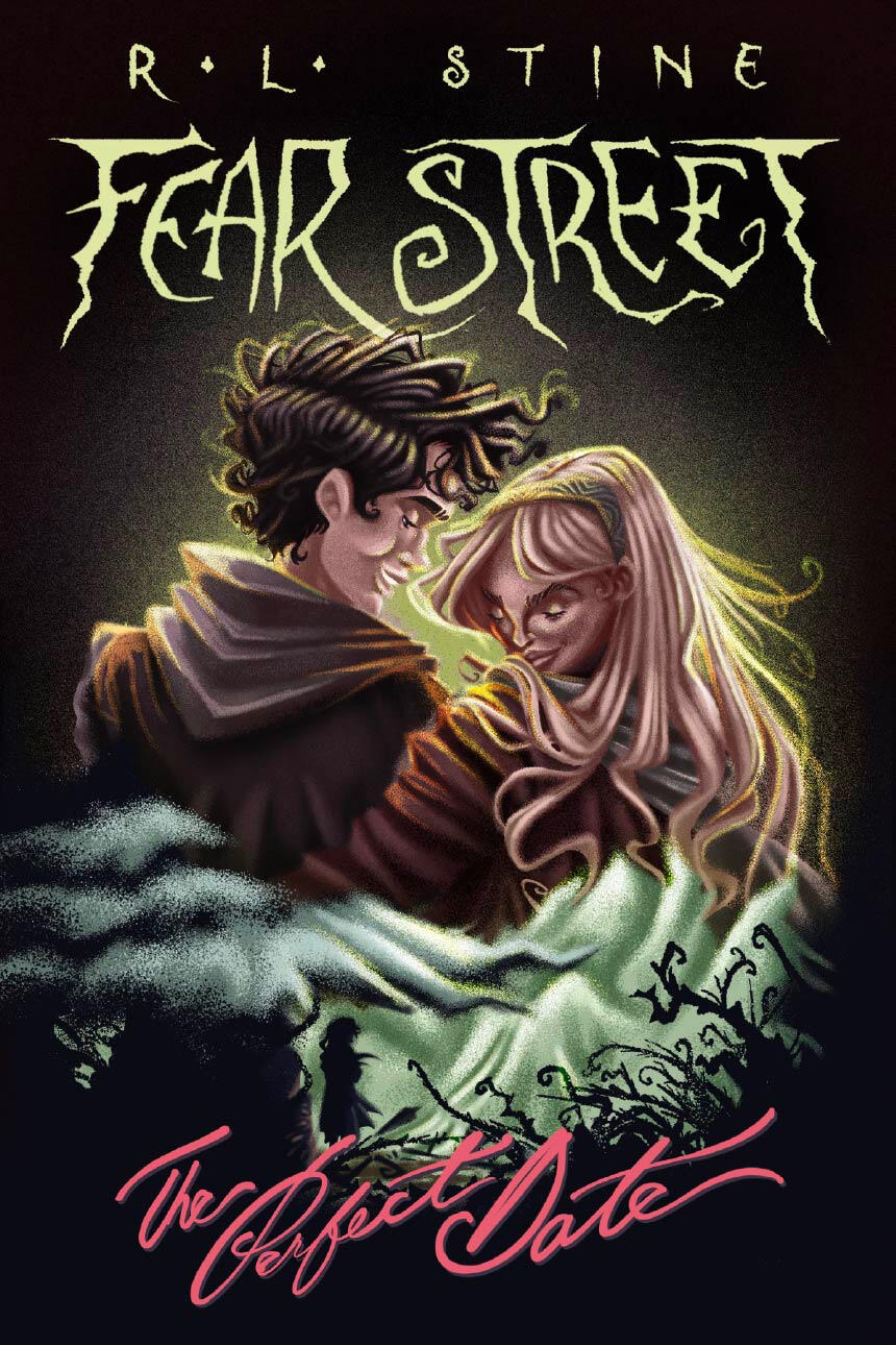
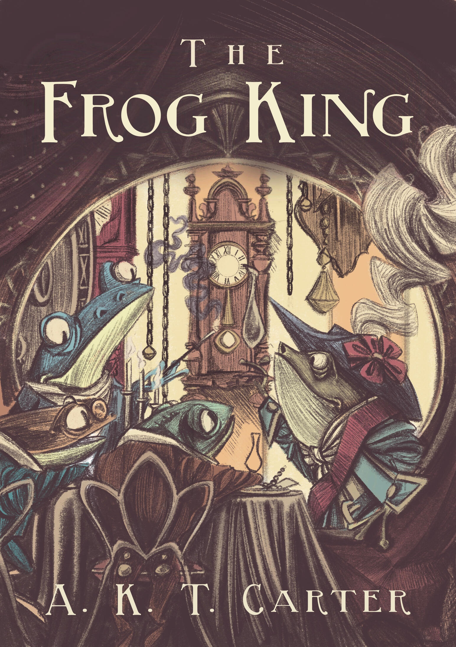
Fear Street: The Perfect Date by R. L. Stine (Cover redesign)


Carousel
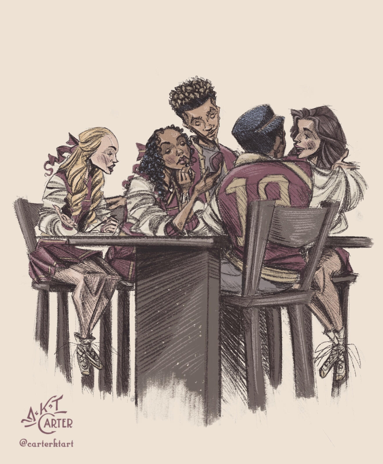
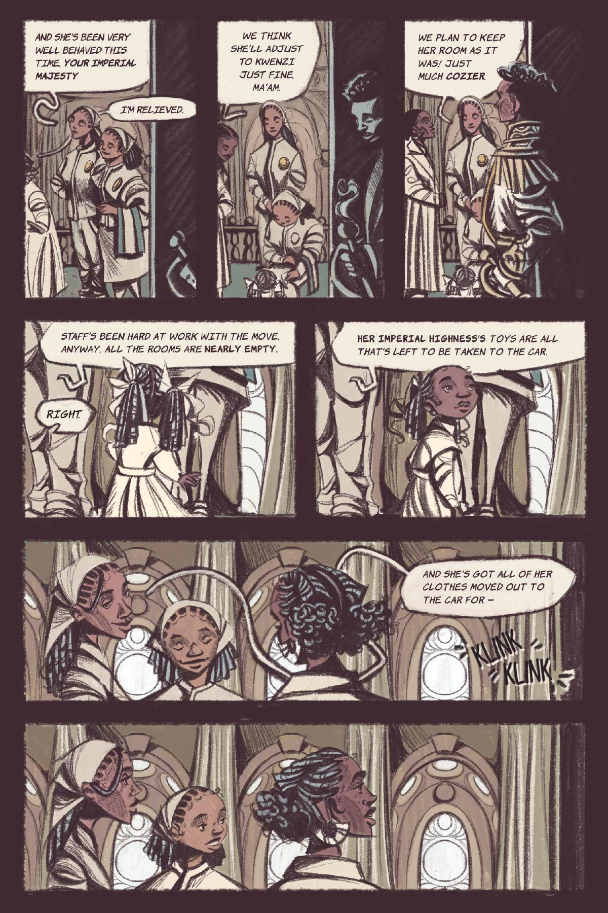
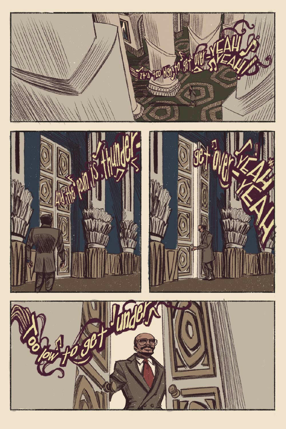
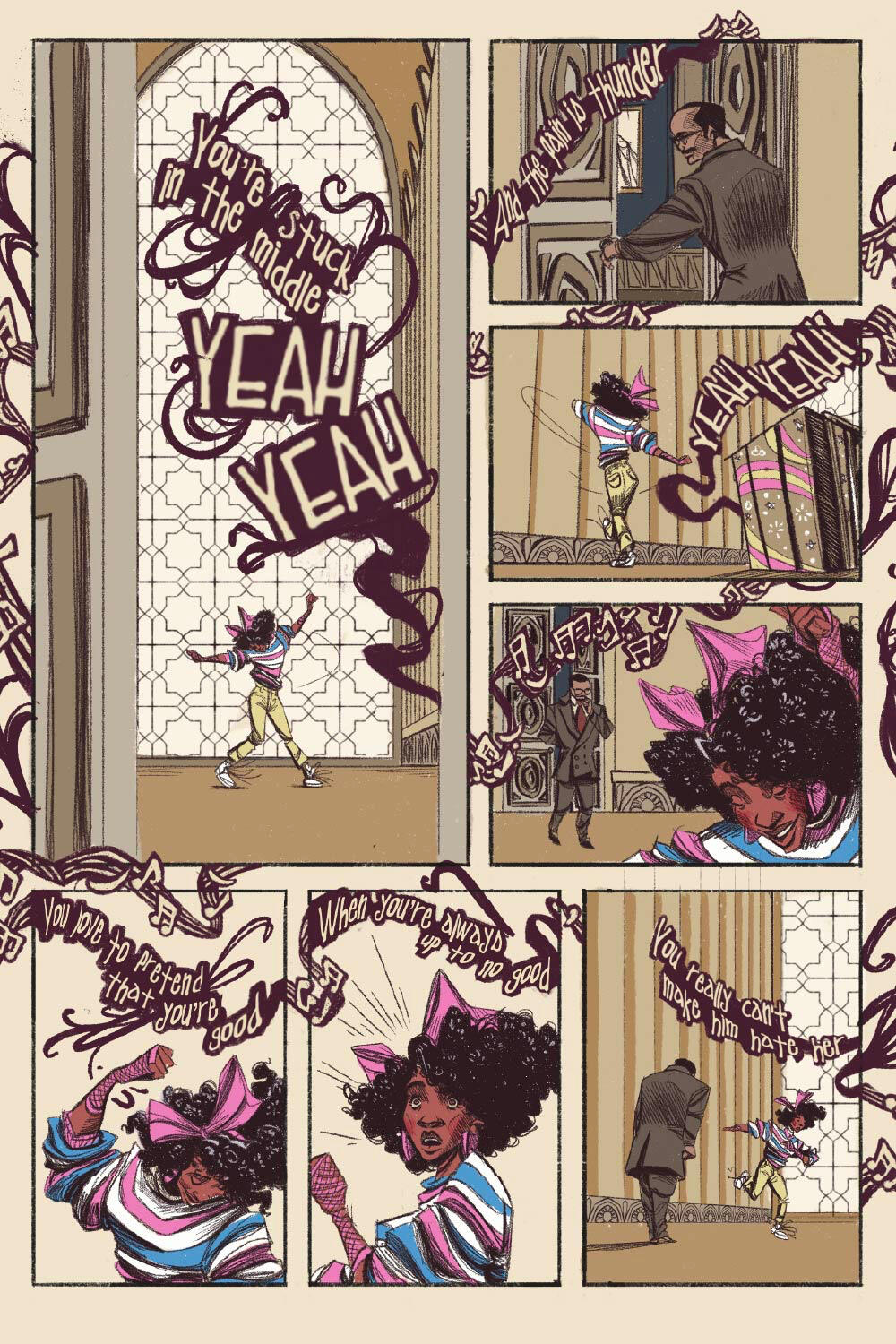
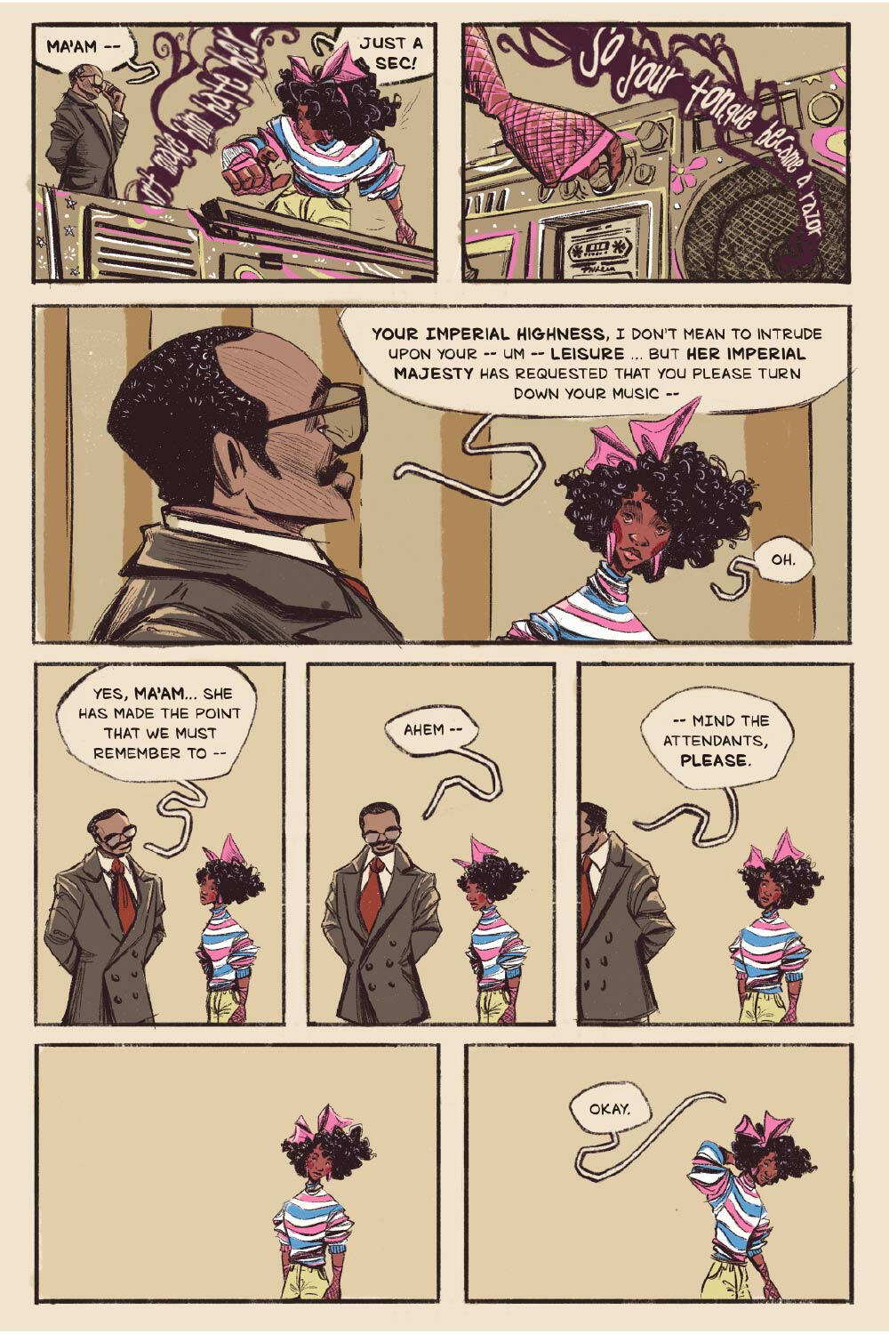
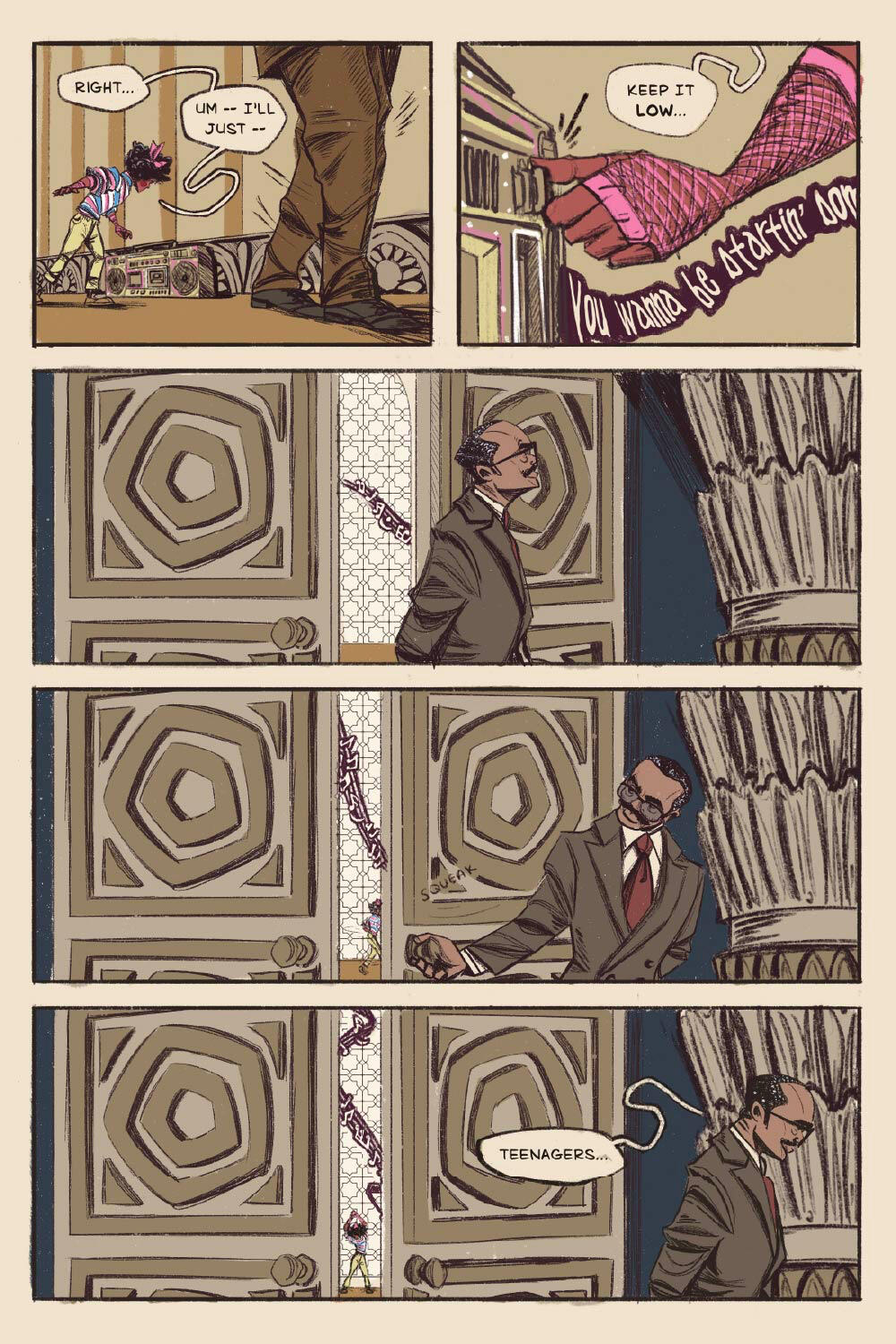
PEROSNAL PROJECT: CHAPTER BOOK
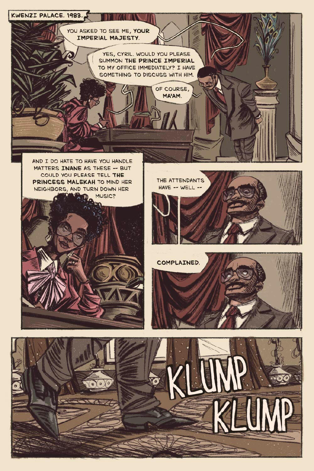
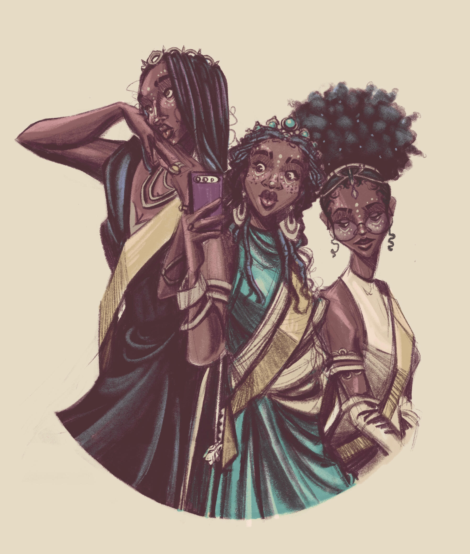
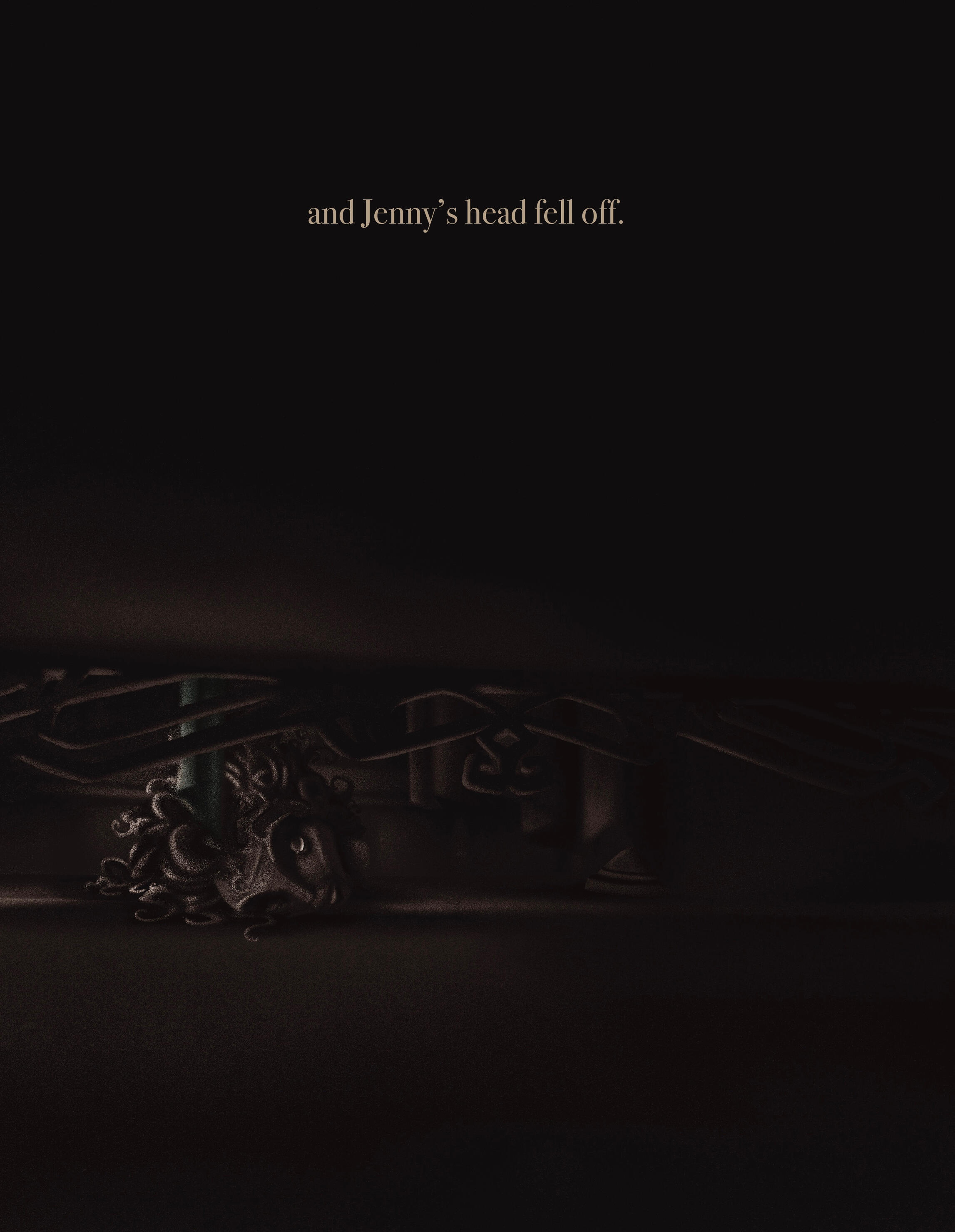
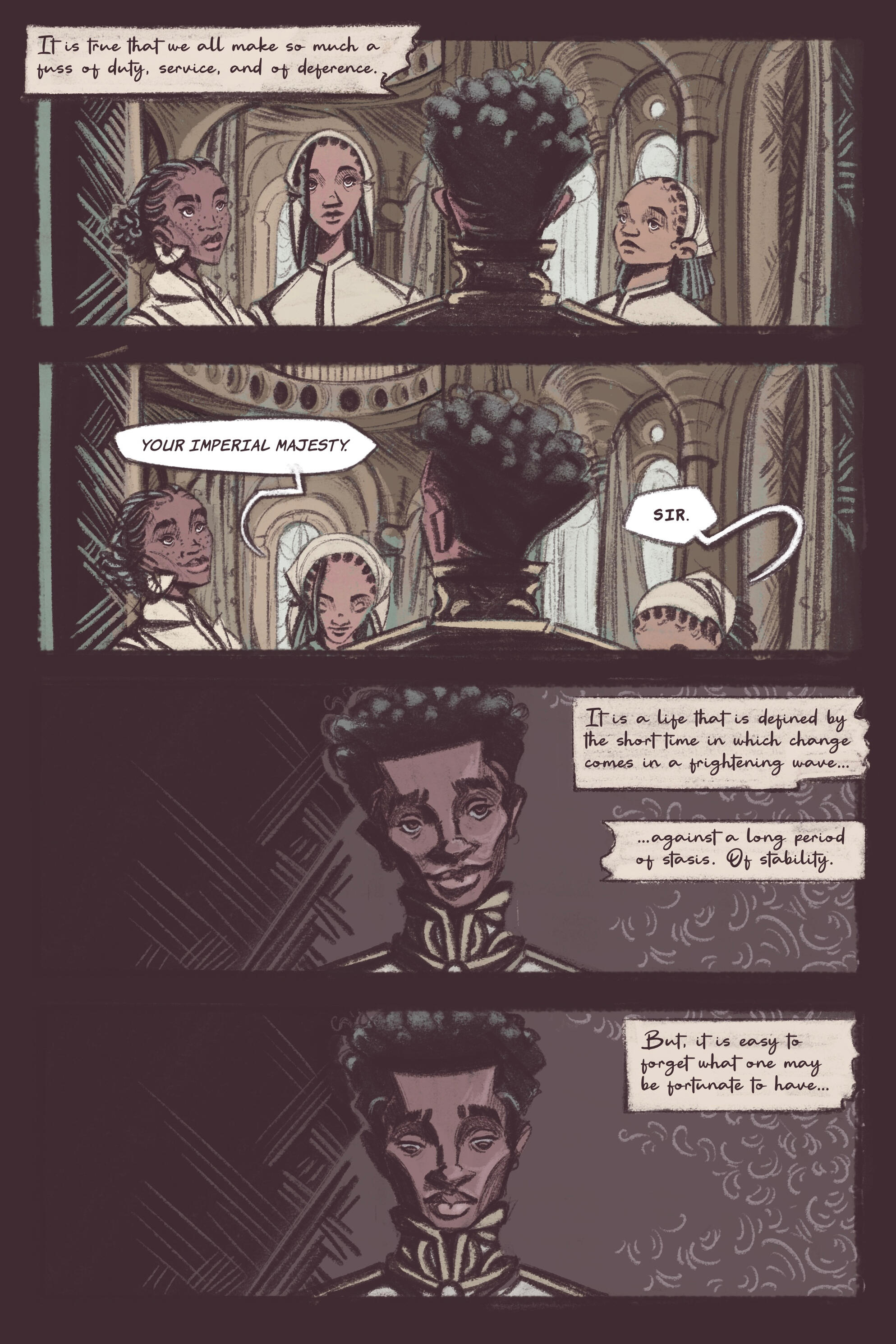
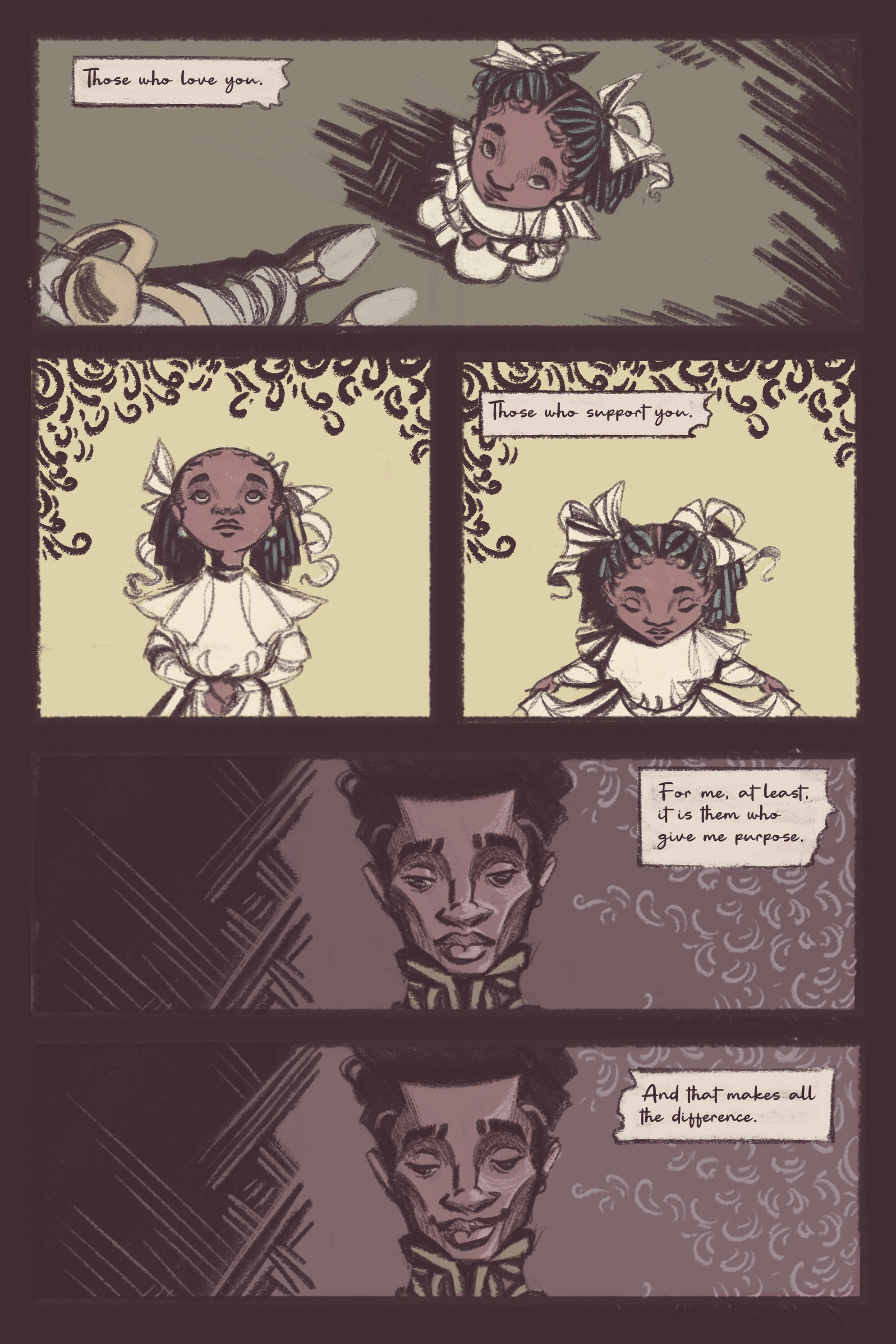
Carousel is a young adult horror fantasy concept that is based on pulpy but fun flair of scary stories of the 1970s and 1980s. The main concern was with creating something frightfully fun and challenging for young readers.The titular character is an otherworldly circus performer who entices a young talent to become part of her attraction. She presents herself as colorful, pretty, and outgoing, however is revealed to be impulsive, threatening, erratic, and (literally) inhuman. It was thus important to showcase these traits in some way from the cover illustration. If not for the glowing yellow eyes, the character would be otherwise unassuming.Scroll down for more!
Full spread
")
Progress works
")
")

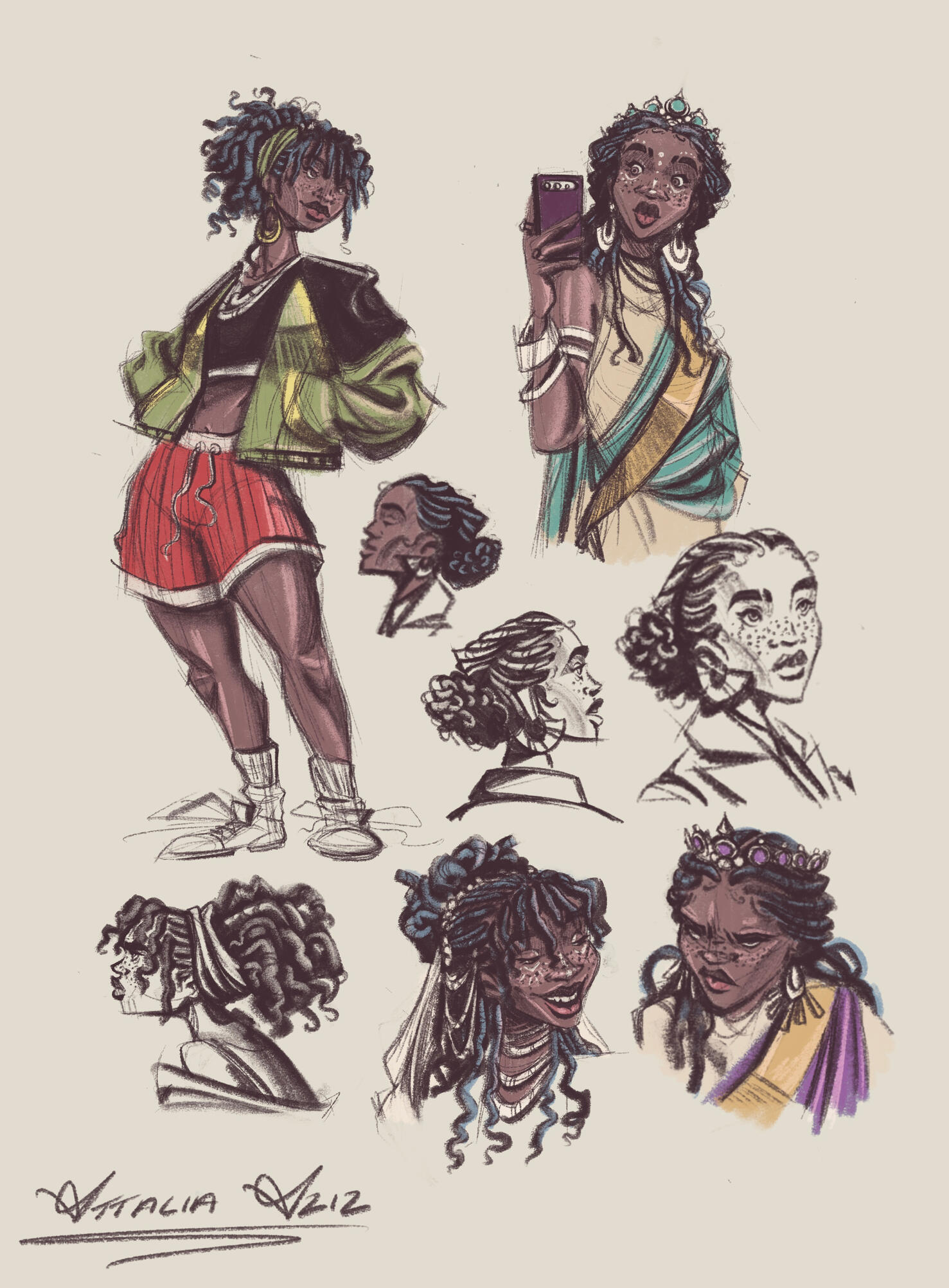
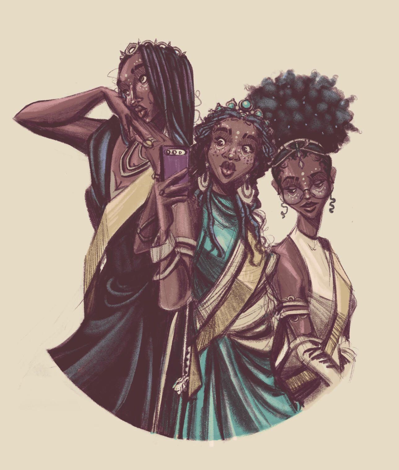
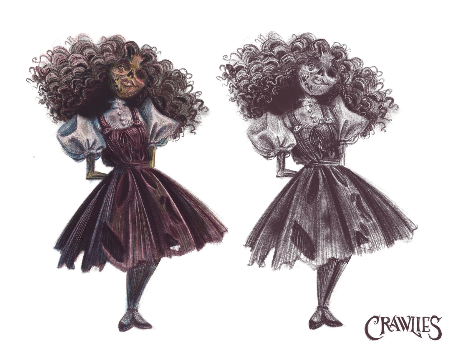
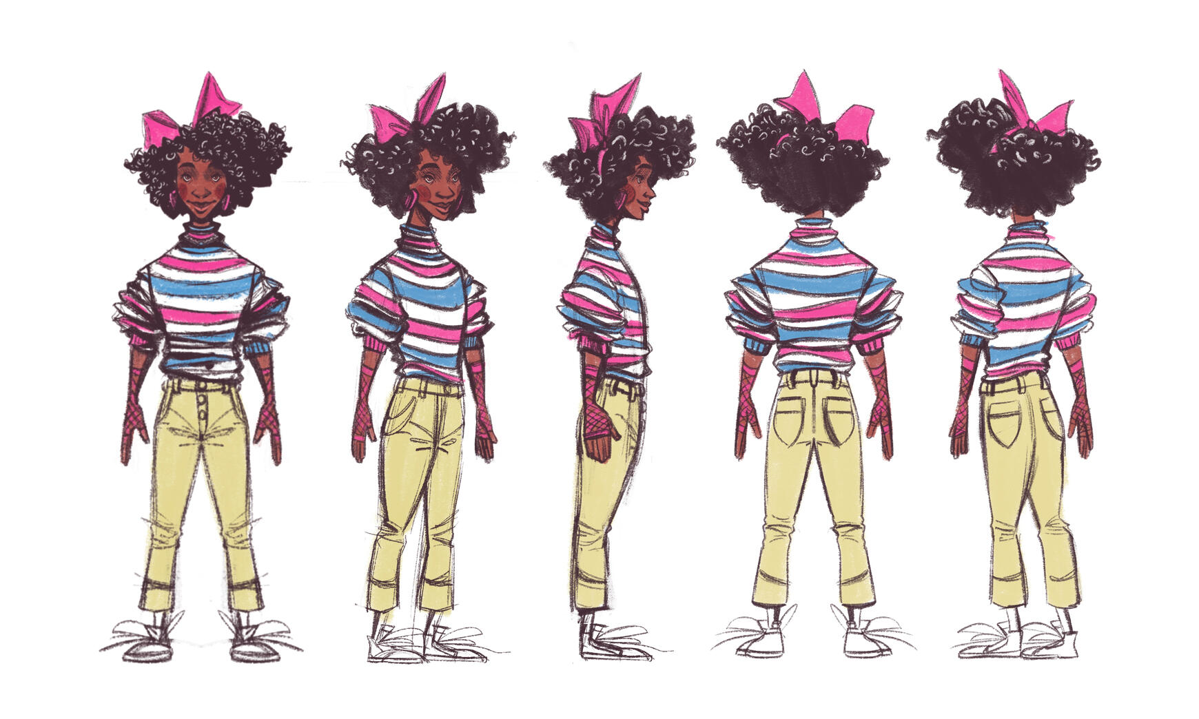
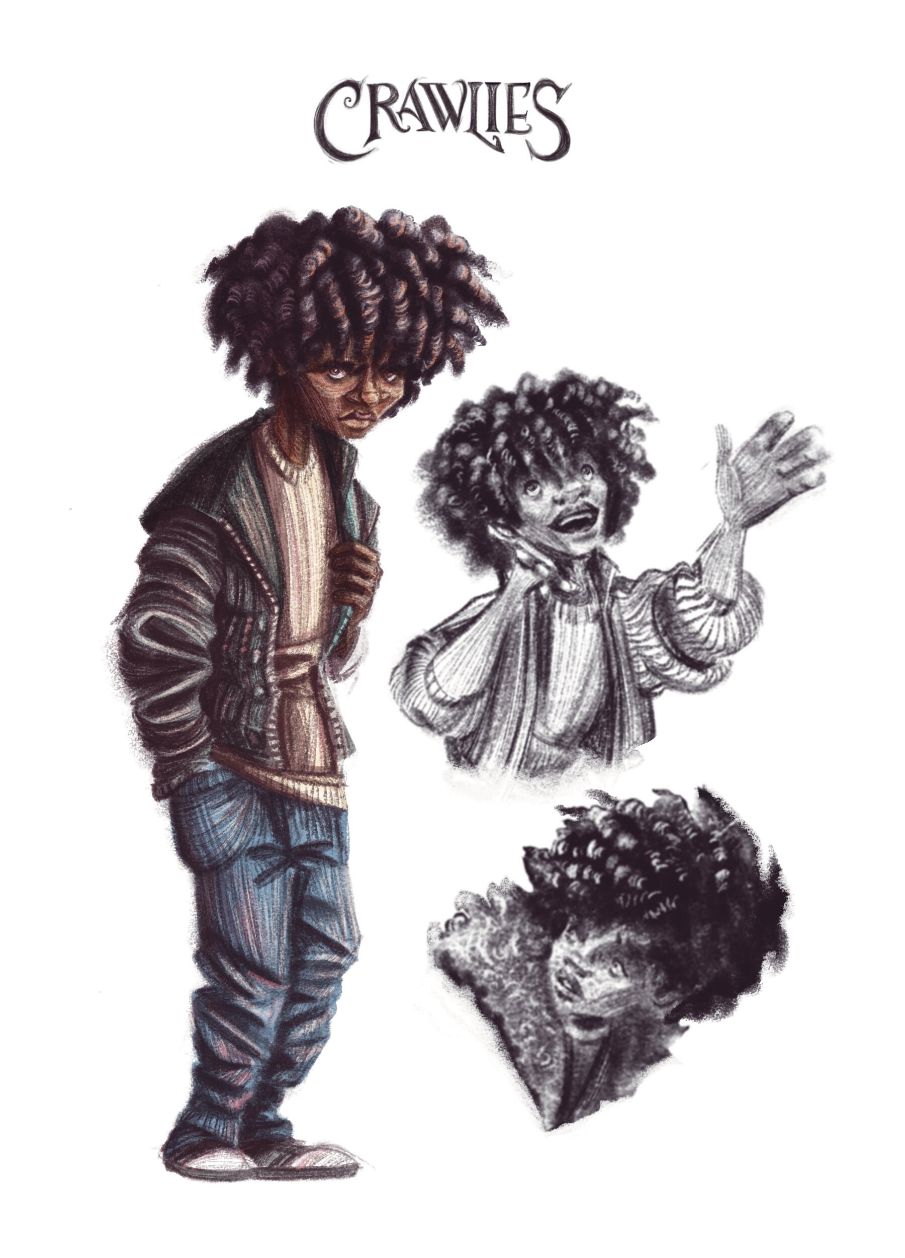
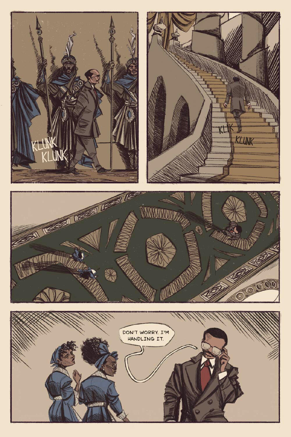
Crawlies
PEROSNAL PROJECT: CHAPTER BOOK
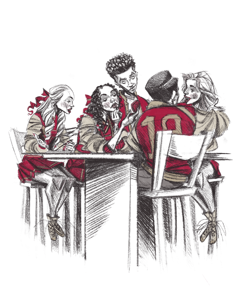
Crawlies is my take on horror for middle-school children, while allowing me to create distinct characters based on established monsters. While it was important that I kept within range of appropriate depiction of horror content in children's illustration, staying on the edge was an essential part of the ideation process. Children like to be scared, and a flashy, ghoulish, but fun and vibrant cover is something that I think would be eye-catching and enticing for more daring young readers!The chapter illustrations below showcase the contrast with the cover, with the monstrous kids actually getting along with the main character and eventually coming together to fight a greater threat during an adventure!Scroll down for more!
Chapter illustrations


Cover and chapter sketches


Character designs


")


Uncle Berry's Lemonade
PRODUCT AND PACKAGING
My goal was to create a brand rooted in agricultural heritage and homemade charm. The three flavors (Strawberry, Peach, and Pineapple) are packaged in bulky glass jars inspired by old farmhouse preserves. I centered the identity around Uncle Berry, a gentle-giant character who conveys warmth, generosity, and the honest labor of rural life.To reinforce the handcrafted story, I developed a woodcut, engraving style for the labels. Each scene places Uncle Berry within the landscape of its flavor, using bold, carved textures reminiscent of barn wood and traditional folk printing. The combination of the hefty jars and the tactile, heritage-inspired artwork creates packaging that feels authentic, storied, and connected to the culture of community-grown produce.


Boesque Jewelry
PRODUCT AND PACKAGING
Boesque Jewelry’s packaging is designed to reflect the brand’s earthy, free-spirited identity, pairing bohemian-inspired elegance with a grounded, natural feel. The palette centers on earth-tone greens, soft creams, and warm browns, creating a calm, organic atmosphere that complements the handcrafted nature of the jewelry. Each box and card is intentionally minimal yet expressive, allowing the jewelry to feel like a discovery—something curated, personal, and connected to nature.The visual language is built around simple bohemian shapes and illustrative motifs, such as sunbursts, arches, dotted constellations, and hand-drawn geometrics. These elements are applied with a light touch, giving the packaging a sense of movement and quiet artistry without overwhelming the product. The result is a packaging system that feels artisanal, wanderer-inspired, and thoughtfully grounded—perfect for a jewelry brand rooted in bohemian culture and earthy sophistication.


Lectly
UI DESIGN
This online eBook borrowing service offers a community-driven way to read, learn, and share. Users can borrow digital books instantly and access in-app resources, including literary notes, annotations, and analysis created by both contributors and fellow readers. The platform thrives on collaboration—readers exchange insights, build collections, and enrich each title with thoughtful commentary. It’s a space where borrowing becomes learning, and reading becomes a shared experience.


Kikka-So
LAYOUT DESIGN
The redesigned menu for Kikka-So draws inspiration from traditional Japanese art, blending clean composition with subtle, hand-rendered motifs. Soft ink washes, delicate linework, and restrained color pairings create an atmosphere that feels both refined and deeply rooted in cultural heritage. The layout emphasizes clarity and balance, allowing each dish to stand out with the quiet elegance characteristic of classic Japanese design.Illustrative accents are integrated, echoing the visual language of ukiyo-e prints and traditional scroll paintings. These details lend warmth and authenticity without overwhelming the modern presentation. The result is a menu that celebrates Kikka-So’s culinary craft while honoring the timeless aesthetics that inspired it.


2025 Venice International Film Festival
POSTER REDESIGN
The 2025 Venice International Film Festival poster redesign embraces a playful, modern interpretation of the city’s cinematic spirit. Using a crisp illustrative, flat design, the artwork features a Venetian couple gracefully dancing atop a traditional boat—each with a vintage film camera for a head. Their silhouttes and gestures capture both the elegance of Venice and the timeless magic of filmmaking, merging place and craft into a single whimsical scene.A muted yet contemporary palette and clean organic shapes give the poster a graphic touch while preserving a sense of classic festival sophistication. The composition balances movement and simplicity, allowing the characters and their iconic camera forms to become the central storytelling elements. The result is a poster that celebrates Venice, cinema, and creativity with a bold, memorable visual twist.


ABC (Jackson 5 album)
ALBUM COVER REDESIGN
This redesign of the Jackson 5’s ABC album cover draws from mid-century modern aesthetics, using clean geometry and playful simplicity to echo the album’s youthful charm. At the center are three heart-shaped letter blocks—A, B, and C—constructed from bold, minimal forms that feel both nostalgic and fresh. Their bright, graphic presence immediately captures the bubble-gum optimism and schoolhouse energy that define the album’s spirit.Arrows playfully pierce through each heart-block, reinforcing the album’s lighthearted love theme with a wink toward innocent, first-crush emotion. A restrained mid-century palette and balanced composition keep the design crisp and iconic, allowing the shapes to carry both retro warmth and contemporary clarity. The result is a cover that feels sweet, timeless, and unmistakably fun—just like the music itself.


Magic City Pharmacy T-Shirt
T-SHIRT DESIGN
This custom t-shirt design for Magic City Pharmacy in Birmingham, Alabama, celebrates the spirit of community and togetherness. Featuring iconic Birmingham landmarks and diverse local figures, the design is a vibrant homage to the city's rich history and the unity of its people. Available in red, blue, and black color variants, the artwork blends local culture with a modern aesthetic, creating a unique and wearable piece that reflects the heart of Magic City. Whether worn as a statement of pride or a tribute to the city's enduring sense of connection, this design embodies Birmingham's vibrant community spirit.


Over the Rainbow (lyric poster)
TYPOGRAPHICAL DESIGN
This lyric typographic poster for Somewhere Over the Rainbow, inspired by The Wizard of Oz, brings the song's whimsical and hopeful essence to life. The grainy texture adds a nostalgic, vintage feel, while bluebirds soar around the intertwined rainbow and lyrics, symbolizing freedom and possibility. The design transitions from sepia tones to vibrant colors, reflecting the iconic moment of transformation in the film. A nod to the timeless classic, this piece captures the magic of Dorothy’s journey and the universal message of following your dreams, making it a perfect tribute for fans of the beloved movie and its enduring song.


2025 Poole Party Postcard
POSTCARD DESIGN
This postcard design for the Poole Party, an annual art auction hosted by the University of Montevallo Art Department, features an interactive and dynamic illustration that brings the event's creative spirit to life. The design showcases characters “drawing” the artwork itself, their hands and tools swirling through sinuous, artsy patterns that flow across the card. The vibrant, flowing lines symbolize the endless creativity that defines the Poole Gallery and the auction’s celebration of artistic talent. A perfect mix of playful energy and artistic flair, this postcard captures the essence of the event and invites art lovers to join in on the celebration of creativity and community.
